Tuesday, 29 November 2011

Prince Of The Holy Sacrament - New single, out now!

Prince Of The Holy Sacrament
My latest single is out now as a downloadable mp3.

As it is a stand alone single, it will not be available to stream from the usual sources and will only be available via online retailers.

This track will bridge the gap between my last album 'The Melody Of Distaste' and the upcoming 'Peasant's Songbook'.

The track was mastered by Music Pimp Machine and features artwork by Emily Ings, who has also provided album artwork for Jackie Oates.

The track is modestly priced at a mere 0.65p


Friday, 4 November 2011

Boring old update.

Nothing very exciting but since I've been a little silent, thought I'd post a little of what has been occupying me of late.

Have been working on my latest solo album which is provisionally titled 'The Peasant's Songbook'. It's on slow boil at the moment but expect a preview single at the start of next year.

Shields Of Justice

Have also been working towards finishing Shields Of Justice - met today with some lovely people at Ashcombe Paintball site - who have graciously offered us use of their land for our fabled 'Vietnam Sequence'.

My second novel (or fourth if you count Cold Highways as three books) is nearing the end of its final draft, which is exciting.

Also on a rather exciting note, my folk band 'The Demagogues' is readying to unleash itself on the world at last, with work going into web trickery and recording at the moment.

I'm also working on a couple of secret projects, which will be revealed soon.

Until then, watch this space...

Thursday, 13 October 2011

The songs that I write...

Actually finding the YouTube video thing quite liberating as it means I'm recording my new songs without spending hours tweaking and tailoring.

Here's a couple of unreleased recordings - a little rough, but it gets the gist across.


Monday, 3 October 2011

Shields Of Justice Teaser Trailer

The Shields Of Justice teaser trailer is finally up!

Whack on some headphones to get the most out of those sexy low frequencies.

YouTube is a strange beasty so a higher def vid will probably go up on Vimeo once we sort it - the compression on here seemed to swallow any colour correction that was done.

Special thanks to our composer, Tom Drewitt, who did a wonderful job of adding a little snippet of the score to the footage.


Shields of Justice teaser trailer from Shields Of Justice on Vimeo.


As always, visit the OFFICIAL SHIELDS OF JUSTICE WEBSITE to keep up with other happenings!

Monday, 5 September 2011

Flandyke Shore

Here's a clip from a new little thing I'm doing - videoing a few songs and popping them on Youtube.

Flandyke Shore is a traditional song and this version is most similar to the arrangement by Nic Jones.

I learnt this years ago and have never really played it, so I think there are a few changes that aren't quite right - either way I was never able to play it to Nic Jones' standard so those limitations have created this arrangement.

Anyone interested in the tuning will want to tune their guitar to what I believe is called Cmodal - CGCGCD.

And for anyone else interested, to my knowledge (and probably defective memory) this song is a variation of Flanders Shore which came from a tune called The Ploughman's Love For The Farmer's Daughter, though the war that it features was a good hundred years before so it is probably older.

I have no idea why the light is 'springing from her clothes'


Thursday, 1 September 2011

That new book smell...

Copies of my first novels, The Cold Highways Trilogy have turned up today.

It's quite exciting unpacking a big box full of your own work, though it has taken a while to get this far and it's still a long way from a career.

It's also strange as I'm nearly at the end of my newest novel and I feel I've come a long long way from the kind of writer I was when obsessing over those books.

Anyhow, to preserve the memory, here are a few pictures of the unpacking.


Cold Highways is available from most online book retailers.


Sunday, 28 August 2011

Other Illustrations...


Whilst digging around on my computer I found a couple of other drawings that I had done ages ago.

Neither of which have been shared with that many people.

The first is a drawing I did for Catherine And The Owl. I seem to remember doing this for the poster to our first gig.

I coloured it in just to see how it would look. Clearly inspired by Edward Lear (though he could draw better).


Ben Tallamy's original Cato illustration

The second Illustration is from some bizarre comic I was drawing called, 'The Billy Corgon Story'.

I can't quite remember why, but I know it used to annoy my friend Tim when I claimed the back of the Melon Collie album was a picture of Billy's bald head slipping beneath the clouds.

Not sure where I was going with this, but I do know that the story involved Billy getting on a ship bound for WW2 that was captained by the infamous 'headless Jack'.
After three years at sea, Billy discovered 'Headless Jack' was in fact a decapitated corpse and that he had been sailing in circles off the coast of Ireland.

I probably shouldn't be allowed so much free time...


The Billy Corgon Story
Well there you are, hope you enjoy.

The Coffin Collector's Album Cover.

Just thought I'd plug a little bit of work I did earlier in the year when I was asked to illustrate the cover of The Coffin Collector's album; Leopardskin Tales.

Kaligula was very specific about the content of the illustration and so the layout and content of the artwork was as he requested - each image referring to a track from the album.

Normally I shy away from illustration as I don't consider myself much of an artist, but I enjoyed working on the cover.

Anyway, here is the image, and be sure to check the band out too!


The Coffin Collector's - Leopardskin Tales


Friday, 29 July 2011

How to write an artist One Sheet (Or at least what I did....)

When I set out to do a one-sheet for my album, i didn't really know what it should look like.  There are countless 'tutorials' out there, but what I really wanted was an example of an actual one sheet.

Unlike many of the other tutorials, I'll show you the one sheet I used, explain the reasoning for it's layout and link to anything that may be useful.  I'll also not ask for any money, unlike those other tutorials that I won't stoop to name.

I used Word to do my press release but you'd have a better time with a program like Adobe InDesign.

The product I was writing about was my solo album The Melody Of Distaste.

Anyway, without further ado; here is my Press Release:


One Sheet
Now I was fortunate enough to have a few patient and kind friends who had seen one sheets before, and thanks to their advice, I was able to pull a pretty good press release together.

The most important thing I learned along the way was that basically, you want to tell the reader what you want them to write.

In the busy world of journalism, no one wants to fish about for information.  Have a good, clear header that not only sums up the release but can also be used as a direct sound byte that they can use, should they wish to do so.
More often than not, you will see your own words being directly used to describe your own product - so make it a good tagline!

My Header
As you can see, I've made sure that a quick breakdown of all the important info is right at the top.

In this case my main points are - I'm releasing an album - it's great - when it's out - where to get it.

I've capitalised the album title and my name just to drive it into peoples subconscious.
Technically I'm doing this right now.  Some would say this whole article is a shameless attempt to link to my music, but hey ho.

Album art and track list
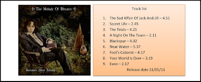
Next up I popped a photo of the album's cover along with a tracklist.  This is optional, as the people reading your press release will probably have a copy of your album anyway.
I used the press release to submit demos to radio stations too, so I made sure to include the length of songs was included here too.

A press release has to be eye catching and so it's a good idea to try and break up any big chunks of text wherever you can.
Try and imagine you're an underpaid journalist, who would rather be anywhere but in an office, on a Monday morning, reading your press release.

If it looks like you've transcribed a portion of the English patient onto a side of A4, you can imagine how unwilling anyone would be to read it.
If you haven't read the English Patient then just remove all the furniture from one of the rooms of your house and spend about twelve hours staring at a bare wall. That should give you a similar experience.

Anyway, onto the next portion:

The Blurb
Here is the meat and potatoes of the one sheet - the blurb. to be honest, I imagined that 70% of the readers wouldn't bother getting this far unless they were interested (much like this blog post).
By this part of the press release, you want to have already given all the information that is important. This is your chance to just sell a few more sound bytes.

Try and think of a few things that could feed an interview or article should it follow - any interesting facts about the project or the people involved.

It is always good to write from the perspective of a third person and make sure not to overdo how much you big thing up. No one likes an egotist!

I broke the blurb into paragraphs which i felt could also stand alone sound bytes, name-dropping the odd track and using a few chose words to steer the tone of the description in the direction I felt would benefit it.

I also had a lovely little quote which conveniently mentioned some of my favourite artists, in the vain hope that I too may get mentioned in the same breath.

Remember to tweak the tone to suit different targets. If you're of local interest, you may want to big that up when sending to towns nearby. Conversely, you may not wish to mention that at all if you're press release is travelling further afield.

Know your product, tell them why the people involved had the unique perspective that created it.

Closing Statement
Now, at the very bottom, you want to make sure the reader has links to whatever forms of contact or websites you're on.

It's also a good idea to reiterate the main points of your document.
Buy my album! That's what I'm saying here (feel it filter into your subconscious) I'm also taking the opportunity to feed them any links I may want them to visit.

Keep it straightforward and to the point. The name; 'one sheet' is literal to that degree.

Press Release
So there you have it, a quick breakdown of what went into my one sheet.

Remember there are no strict rules as to how it should look but in order for it to be effective, you want to make it eye catching and to the point. Don't make the reader have to hunt for any info.

For every twenty you send out, only one or two may get you anything, so don't be disheartened. It's also often hard to tell whether you've had any response at all, so just keep sending them out and see what happens.

If you visit my web page for my album; The Melody Of Distaste, I will slowly put up any reviews I received and where applicable, link to the sites that were responsible.
Please feel free to submit your own music to them as well - if they reviewed me then they must be open to submissions!

Also, please share this article with as many musicians as you can -  no one should be charged for this information.
Obviously, it's great if you visit my site etc, blah, blah, blah, but I spent many hours sifting through countless pages of bollox before piecing together what I was doing.

I hope this will save you that misfortune!

Anyway, as always, feel free to comment if anything isn't clear.

Best Of Luck!


Thursday, 28 July 2011

Prop Building For Paupers...

Just a quick link to another blog I'm involved in.

As part of the Shields Of Justice project, we are slowly updating step-by-step builds of the props used in the film.

Shield Of Justice


There are also numerous posts about costume and sets, so please, have a gander.


Tuesday, 19 July 2011

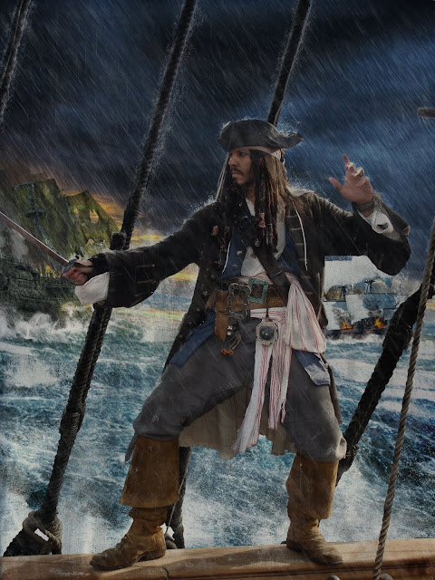
Photoshop tips - changing a nice day into a stormy piratical adventure on the high seas with none other than Captain Jack Sparrow kicking metaphysical ass!

Not a tutorial as such, but thought I'd do a post about a little bit of work I've been doing for my good friend Jonty Depp.

He asked me to replace the background of a picture he'd had taken of him aboard the HMS Bounty in Plymouth (not the real one obviously, that was burnt to a crisp).

Seemed like it would be a shame not to add some exciting swashbuckling staples, such as; rain, ships, fire and explosions. Since the result was pretty good, i thought I'd share how i chose to do this.

As with many things in the world of art, it's all about time.  Photoshop does all the clever stuff for you and thoughtful usage of simple techniques can combine to achieve great results. Unless you're willing to put in the hours though, it's all meaningless.

Take the care and time to do a good job and you will get good results. As with all these things, it's a combination of good taste and patience.

remember when using brushes to always use new layers, you can make one by holding ctrl+shift+N - i often folder (shortcut ctrl+G) them into groups and will often create layers for each additional daub of the brush before merging them down when I'm happy.

I won't go into a step by step of each section, but rather explain what i did and link to tutorials elsewhere to help with each of the techniques.

There are probably better techniques than the ones I have used and if anyone knows alternate ways to do things, please feel free to post them in the comments section.

I will assume you can use Photoshop to a fairly good standard, but I'll also note shortcuts where i can remember them, as they're always useful and I'm still learning them even now.

Anyway,  here i will explain how to change this:

Jonty Depp at Plymouth


Into this:

Jonty Depp fighting the forces of darkness in an epic war between good and evil. Huzzah!!!!
Basically the events leading up to this moment are thus - upset with projected cuts by the coalition government, crime-fighting, biscuit-fiend, Jonty Depp takes to the high seas.
Along the way he sets fire to his ship and poses in the rain with his sword drawn. Basically similar to the plot of Pirates Of The Caribbean Three, except with biscuits in it.

The first thing I did was to cut out Jonts. This took ages - no way around it. The background was busy and although the Magic Wand Tool (shortcut W) took out some of the sky, there was a lot of reflected light which chopped chunks out of Jonts.

Another way I usually cut out images is with the Colour Range option, again though, i was losing a lot of detail.

Instead I laboriously Lassoed the image (shortcut L).

It made me bored and very tired doing it, forcing me to play Monster Hunter Tri for many hours afterwards, just so i wouldn't dream of the little shimmering lines of the lasso tool.

One useful tip with the lasso is that by holding the shift key you can add to a previously selected area - useful for fine tuning a selection. I usually preceed the usage of this technique with a quick expletive, helps keep me in 'the zone'.

By pressing the ctrl+shift+I shortcut inverts a selected area too - meaning you can un-lasso anything you want to keep.

I don't usually say anything when i invert the selection, but I do however have a strange compulsion to say the names of shortcuts as i use them. No idea why. a particular favourite is, "Ctrl+Z"  For when i make a mistake and need to undo a step.

Once the area is selected, press Delete to chop them out. (make sure you're on a layer that isn't the background) I used a horrible green for the background so i could clearly see what was left.

You can use masks to do this, don't know why i didn't.

 
Tasty
Looks kinda like Jonty's in a major film studio, shooting in front of a green screen - two things which thanks largely to working with me, will never happen.

Anyway, check it's all nice and tidy. A little trick i like to do is to apply the stroke layer style. This tends to highlight any missed bits on the background, just make sure to turn it off afterwards.

Once that was done, I manually blurred the very edges with the handy Blur Tool (Remember, you can increase/decrease any brush sizes by using the [ and ] keys - also Caps lock turns the brush on and off, something that can be confusing if you do it by accident!) This just helps blend the image overall.

I also at this point i thought it would be funny to pop a picture of Slough behind Jonty. It wasn't funny, but then again, I'm fine with that.
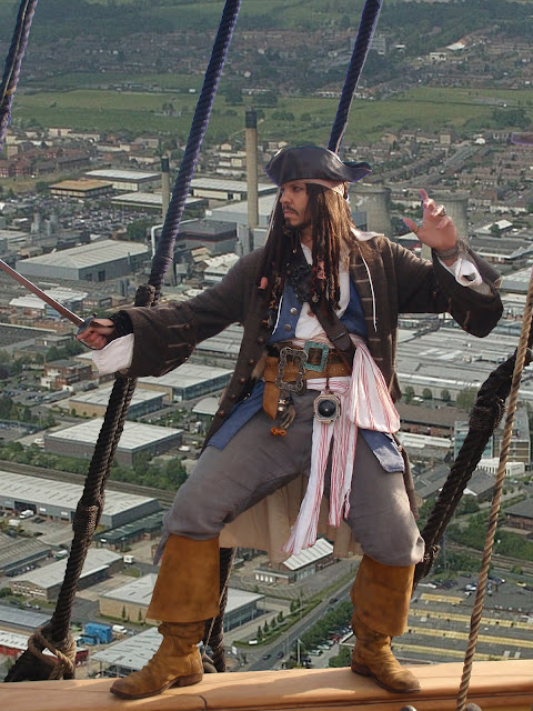
Come friendly bombs...

Once that was done, i duplicated the layer and desaturated it, then changed the blending mode to Hard Light, this ups the contrast and makes the image look less 'washed out' - i brought the opacity down to compensate but you may want to play with the levels.

Colour correction is a pretty boring affair but it always helps to adjust the hue/saturation, colour balance and levels to match what you're working with.  I usually wait till my scene is assembled so i can blend things better.

Anyway the next thing i did was add in some sky and sea.
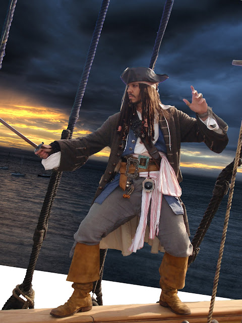
sky added
I got these images off google search - unless you're chopping beyond all recognition, make sure you own copyright fro the images - blah blah! This isn't a commercial job so i did try and get copyright free pictures - you'de have to be pretty good to spot them once i was done with them though.

Anyway, that was rotated and twisted with the transform tool before some sea was added. Remember, when using the transform tool you can use the pointer (shortcut V) to click the icons on the selection box. holding Ctrl will let you skew the dimensions, where as Shift will constrain proportions - useful when scaling.

Anyhow, next i added some sea and used an eraser (shortcut E) to trim a ocean like horizon line.
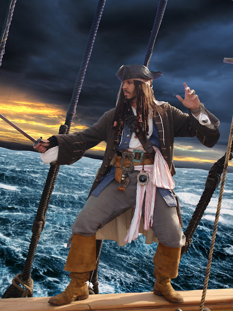
well at least now it looks like a ship

I put a bit of a dutch angle on the sea, though in real life jonty would just fall over. But hey ho.

Now I duplicated the sky layer and pulled it down over the sea to form a reflection. I changed the layer blending mode to vivid light, lowered the opacity, before erasing everything but the strip you sea in the picture, which sells the two images as being one.

I then used the fantastic Ron's Splash Brushes, to paint some spray over the join. Welding the sky and sea together without seem, as Conrad once said, i think.
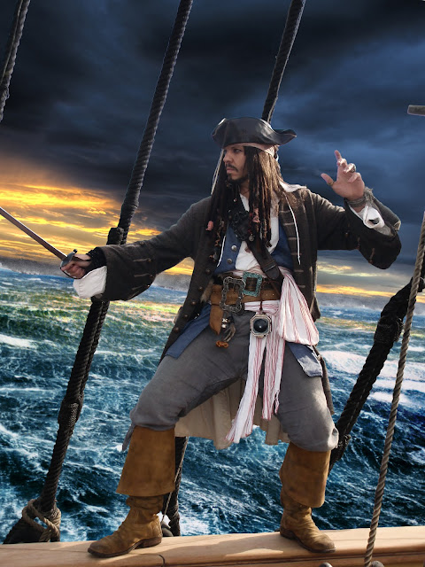
Arrr!
Next i chopped out a couple of ships and slapped them on the ocean wave.
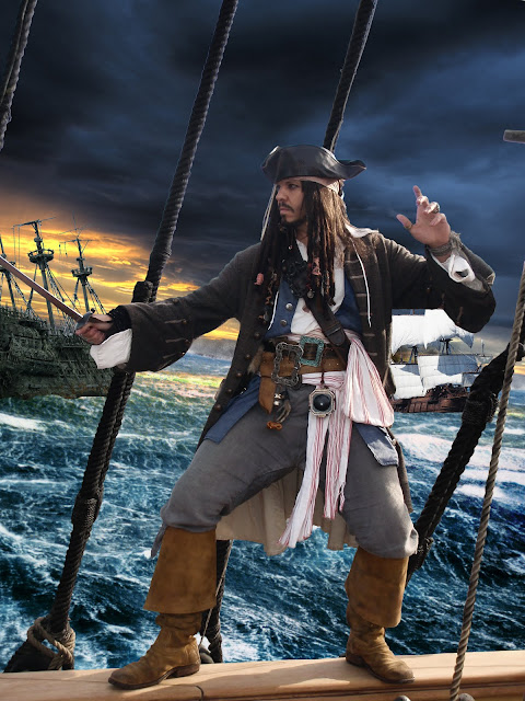

Ambushed!
Now using the ever funky Ron's Splash Brushes again, i painted in (on separate layers) spray along the base of the ships - i also added a rain layer just above the background, and some foreground spray where the waves were hitting jonty's ship.

Like so:
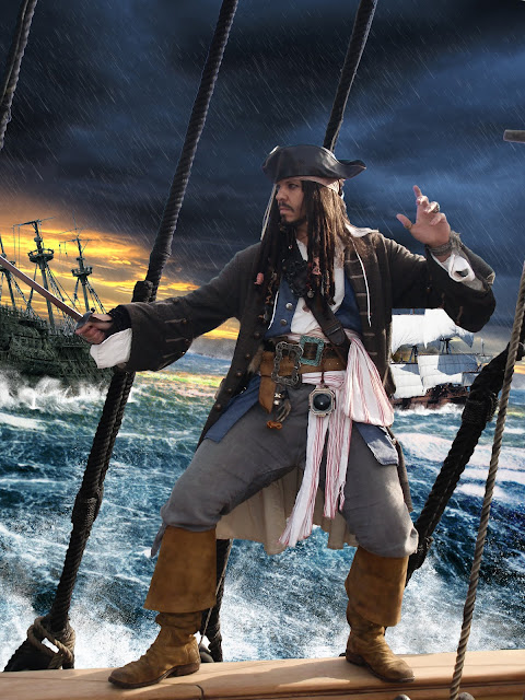

Woooooosh!
Now, let's look at our ships...bit naff. why has the dutchman not got any sails?

well, hopefully you wouldn't have this problem but i could only find a high res image of the actual ship in dry dock - so no sails.

I made my own just by cutting and twisting a picture of some seaweed, as you'll see in a moment. I think i did a shit job of the sails, so lets not go into that.

However - where's the battle? I wanna taste blood and brimstone, hear the thunder of distant cannons...

Well for that you'll need two more awesome brush sets.

Ron's steam and smoke brushes which are awesome, and Obsidian dawn's fire brushes (makes me realise i should use deviant art more.)

Using these brushes, i painted in cannon smoke, flames on the blazing ships, smoke from the flames and muzzle flashes. (you may want to add lighting effects, but i was always going to blur them slightly, so didn't bother.

For the flames i used a bright yellow before adding the layer styles of  outer glow red and inner glow orange - i had to set the blend mode on each effect to normal for them to show. i also painted a little white heart to each flame - rememeber fire goes - white, yellow, orange, red, black.

I also added a few splashes from stray cannon hits and colour corrected/blurred the ships - the result was this:
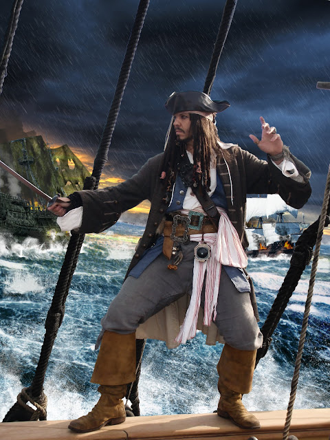
Garrr! Booooom!

I now started to add the thing a lot of people miss out when doing rain effects - the dust and drip it creates as it rattles off of your vile creations. In this case - Jonty.

There is no quick way to do this - i some times had a layer for each splash - rotated and shrunk to place before merging.

First of all i started behind the main layer - painting the drip and spray off the rigging and off jonty's back.

I used colour dodge for the blend mode, but there are probably better ones - after doing that i added more rain between jonts and the background ships, as well as a distance haze to separate them.

I lowered the opacity on each of the rain effects so make sure you play with that!

Here is the result:
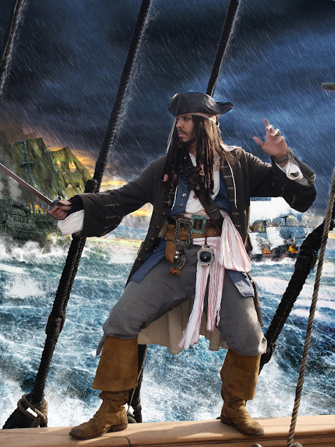
What a drip!!! Ha Ha Ha....sigh....I'm so alone.
Well, that was better but jonts still looked like he';d been out in the sun all lah-dee-dah!

Using a black brush with minimum hardness, i painted on wet patches - normally during battle these would form around the armpits and groin, today however i chose a more liberal usage.


I used the Darker Colour blend mode and dropped opacity to about 20%.
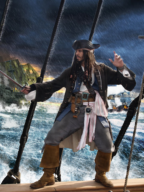

Patchy!
Yeah, i know it looks a bit shit...

However, next i painted on droplets on his boots, hat and sword. As well as drips off his body.

for the droplets i used the layer style of Bevel and Emboss - i used the spikiest gloss contour and popped the layer fill opacity in the blending options to 50% - this gives it a glassy look. This tutorial explains the effect better than me: Tutorial on water drops.

The result after that looked like this:
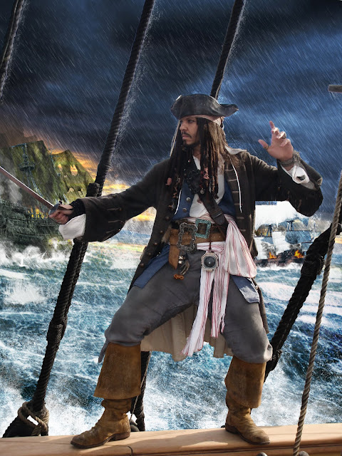

Hmmm....

Then i painted rain splashes on jonts and the rigging, and the rails in the foreground. There are about 120 layers, so it took a while. the result isn't quite what I'd hoped (another 120 layers would sort it) but as I said at the start - it's all about time, and i reached my fill for now.

The result is this:
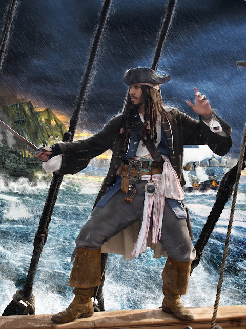
splish splash!

Then it was time for - More rain! I added some drips as well as a bit more haze. I made sure to keep it away from Jonty's face to much so he wouldn't get lost.

I also popped a canvas texture over the whole image, with a low opacity and the blend mode set to multiply.

This not only gloomed it up but added a less digital feel to the image.
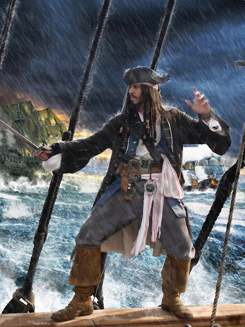
Rain...
And misery!
Now all that was missing was a little bit of composition to offset jonts, i felt there was a lot of space above and below and that some framing was needed to pull you in to the the picture.

Using those tasty fire brushes, i added some flame in the foreground, complete with smoke and embers. I used pretty much the same settings as before but added more layers, as it was easier to see now.

I also added some lightning to the flank Jonts. I used obsidian dawn's brushes and used the smoke brushes i had used before to paint a luminescent glow to the clouds surrounding each bolt.


I added outer and inner glows as with the fire, but aimed for pale yellows this time - all being done, i pulled the fill level down on each layer to soften the effect.
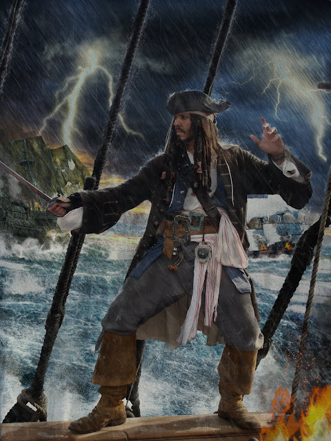

Something's not right...
Call me pedantic but it really bothered me how dry the deck looked.


Where's the water?

So i lassoed the rigging and feet that should reflect on the deck and copied it onto a new layer (right click - layer via copy)

I then flipped the image and lined it up with the edge of the deck and added a motion blur that was parallel to the line of the hull.

I then used ocean ripple to distort it some more before switching the layer blend mode to Darker Colour and lowering opacity.

Here's the result:


Ooooo, wet!

With that being done - i think the picture was complete.


Jack Sparrow in the rain.

So there you have it - a few nifty brushes and some simple effects combine forces to collectively kick ass!

Hopefully my ramblings made enough sense should you want to do anything similar yourself.


Remember to visit Jonty Depp's site and my own site; Ben Tallamy Website.

Wednesday, 29 June 2011

Updates...

Some progress reports, as everything seems to be very busy at the moment.

Finished the drafting process of my fourth novel last week and have been busy with the Shields Of Justice Website since then. The main content should be done within the next week but we are going to try and get some clips and trailers uploaded before its launch. Should be all done very soon though.

Tomorrow we are shooting with the AC Cobra, which has finally made it down from Bristol, have also promised myself as a flautist for Andy B's album next Monday, so time is tight at the moment.

On a more entertaining note, I shall leave you with this bit of photoshoppery i threw together today:
Japanese Shields Of Justice  Season 5 Poster 1977
Watch this space!

Wednesday, 15 June 2011

Cold Highways: The Complete Trilogy - Out Now!

Cold Highways


I'm happy to announce that my first three novels are finally available in one volume, as a complete paperback.

This 6x9 paperback contains all three books - The Dead,
Cities And Signs, and Aires Deep Standing complete at just under 550 pages.

It also features a wonderful cover photograph by Emily Ings, who recently also did the cover for Margaret Atwood's Alias Grace.

Alias Grace


As more sales channels open up, the book will be available from other sites, at present though - visit Amazon for the hard copy.

The three books are also available in single paperback editions or as a downloadable ebook for the Kindle or Kindle android phone apps.

You can download a free sample of the books by visiting the Kindle store here.

Monday, 2 May 2011

The Wattingers - Killer Set

Just thought I'd share a link for a video i was involved in the making of. This is from the fantastic band; 'The Wattingers.'

Check it out!


We shot at the end of last year in a fabulous set Martin had constructed in his garage.

For more information on the band, check out:

Wattingers official site.


Friday, 25 February 2011

old news/new news - the Catherine and the Owl ep design

Since there is very little in the way of images for the By your hand, I am spared EP, I thought it's about time they appear somewhere. I don't tend to mention my graphics work too much, but I'm a bit of a dab hand in the old photoshop.

I can't take credit for the original Cato logo though, that was a fabulous bit of design by Ren X.

The process involved a mix of media - all the illustrations were hand drawn by myself, many of the textures were created specially and for the under disc image, a 3D model was built.

Catherine and the Owl 'By your hand, I am spared' EP cover detail.
The photo that appears on the booklet back was taken by Emily Ings. Not much to say for the cover - i have uploaded the image at a massive size so anyone into graphics can see how it was put together.
Catherine and the Owl 'By your hand, I am spared' EP inner booklet detail.
The inside of the booklet was put together in photoshop using original illustrations which i had lazily done in pencil whilst watching the Die Hard trilogy (I know there's four but i didn't get that far).  The original concept for the EP was sinking ships, but the band wanted the track 'Bergundi' to be the title track.  The problem was, Bergundi was eight minutes long, and for fear of annoying people by putting it first, the track was moved to the end of the EP. The title was then chosen from a lyric in the song, hopefully letting people know it was the intended as the meat of the CD.

To reflect the original title - a sinking ship appears on the cover, then again in the centre. Representing the track Loose Lips, Sink Ships.

Reflecting each track in order is a lighthouse - for Inro (Inro being a Japanese medicine box, the original title 'Beautiful Genocide' was thought to have a whiff of the gas chamber about it.) A sinking ship for Loose Lips, Sink Ships. And a house by the sea for Bergundi (a location in the song lyrics.)

In Russian(ish) beside each image appears a choice lyric. 'If i were a free man', 'Cold, Coney Island soul' and 'This is the end, of the greatest love affair I ever had (with myself)', respectively.

The text that appears faintly in the background is from my own novel 'Cold Highways' - so there is no danger of copyright infringement should it be legible.

Here are the original untouched illustrations.

By your hand, I am spared illustration by Ben Tallamy.

By your hand, I am spared illustration by Ben Tallamy.
 The disc art.
Catherine and the Owl 'By your hand, I am spared' EP disc detail.

Not much to say about the disc really, as it's pretty straight forward - the texture was originally made for a web background but never used.

Catherine and the Owl 'By your hand, I am spared' EP Tray liner back detail.

The back cover was chopped together in photoshop - close inspection will reveal how the books, shelves and labels are all seperately put together in layers.  The books were taken from an antique book database painstakingly cut out - shadows and highlights were then painted in manually to add depth to the image. The titles and extra text was then added to complete the image - lovely.

Catherine and the Owl 'By your hand, I am spared' EP tray liner inside detail.
The inside tray liner is a photograph of a 3D model I built for the project.  The model follows the book theme - with old Catherine and the owl posters disappearing into a deep void (original posters designed by Ren X). Dunno why they're doing that, perhaps it's a metaphor for our career - I dunno.

The tiles on the walkways were hand painted using my great skills that were acquired by painting warhammer models as a kid. In retrospect i wish i had built the model much deeper, as the effect is not quite as i hoped.  All the posters were supported on wire which a removed in photoshop later.

Catherine and the Owl 'By your hand, I am spared' EP model detail.
 These two slightly ropey photos show slightly more detail of the model.  The texture at the base was knocked together out of several photos of tunnels and tubes.


Catherine and the Owl 'By your hand, I am spared' EP model detail.
And here is a couple of pictures showing the exterior of the model and how it was crudely lit - light below came through my conveniently glass table.

Anyway, that is the Catherine And The Owl 'By your hand, I am spared' EP design.

It is available to purchase on itunes.

visit Catherine and the Owl's official site for details on them, and my own site, for details on me.

Until next time...