Not a tutorial as such, but thought I'd do a post about a little bit of work I've been doing for my good friend
Jonty Depp.
He asked me to replace the background of a picture he'd had taken of him aboard the HMS Bounty in Plymouth (not the real one obviously, that was burnt to a crisp).
Seemed like it would be a shame not to add some exciting swashbuckling staples, such as; rain, ships, fire and explosions. Since the result was pretty good, i thought I'd share how i chose to do this.
As with many things in the world of art, it's all about time. Photoshop does all the clever stuff for you and thoughtful usage of simple techniques can combine to achieve great results. Unless you're willing to put in the hours though, it's all meaningless.
Take the care and time to do a good job and you will get good results. As with all these things, it's a combination of good taste and patience.
remember when using brushes to always use new
layers, you can make one by holding ctrl+shift+N - i often folder (shortcut ctrl+G) them into groups and will often create layers for each additional daub of the brush before merging them down when I'm happy.
I won't go into a step by step of each section, but rather explain what i did and link to tutorials elsewhere to help with each of the techniques.
There are probably better techniques than the ones I have used and if anyone knows alternate ways to do things, please feel free to post them in the comments section.
I will assume you can use Photoshop to a fairly good standard, but I'll also note shortcuts where i can remember them, as they're always useful and I'm still learning them even now.
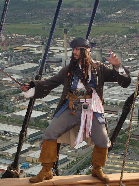
Anyway, here i will explain how to change this:
 |
| Jonty Depp at Plymouth |
|
|
|
|
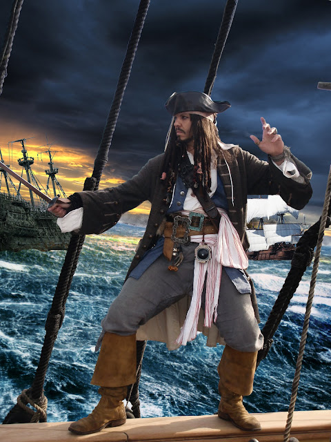
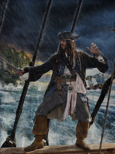
Into this:
 |
| Jonty Depp fighting the forces of darkness in an epic war between good and evil. Huzzah!!!! |
Basically the events leading up to this moment are thus - upset with projected cuts by the coalition government, crime-fighting, biscuit-fiend, Jonty Depp takes to the high seas.
Along the way he sets fire to his ship and poses in the rain with his sword drawn. Basically similar to the plot of Pirates Of The Caribbean Three, except with biscuits in it.
The first thing I did was to cut out Jonts. This took ages - no way around it. The background was busy and although the
Magic Wand Tool (shortcut W) took out some of the sky, there was a lot of reflected light which chopped chunks out of Jonts.
Another way I usually cut out images is with the
Colour Range option, again though, i was losing a lot of detail.
Instead I laboriously
Lassoed the image (shortcut L).
It made me bored and very tired doing it, forcing me to play Monster Hunter Tri for many hours afterwards, just so i wouldn't dream of the little shimmering lines of the lasso tool.
One useful tip with the lasso is that by holding the shift key you can add to a previously selected area - useful for fine tuning a selection. I usually preceed the usage of this technique with a quick expletive, helps keep me in 'the zone'.
By pressing the ctrl+shift+I shortcut inverts a selected area too - meaning you can un-lasso anything you want to keep.
I don't usually say anything when i invert the selection, but I do however have a strange compulsion to say the names of shortcuts as i use them. No idea why. a particular favourite is, "Ctrl+Z" For when i make a mistake and need to undo a step.
Once the area is selected, press Delete to chop them out. (make sure you're on a layer that isn't the background) I used a horrible green for the background so i could clearly see what was left.
You can use
masks to do this, don't know why i didn't.
 | | |
| Tasty | | |
Looks kinda like Jonty's in a major film studio, shooting in front of a green screen - two things which thanks largely to working with me, will never happen.
Anyway, check it's all nice and tidy. A little trick i like to do is to apply the
stroke layer style. This tends to highlight any missed bits on the background, just make sure to turn it off afterwards.
Once that was done, I manually blurred the very edges with the handy
Blur Tool (Remember, you can increase/decrease any brush sizes by using the [ and ] keys - also Caps lock turns the brush on and off, something that can be confusing if you do it by accident!) This just helps blend the image overall.
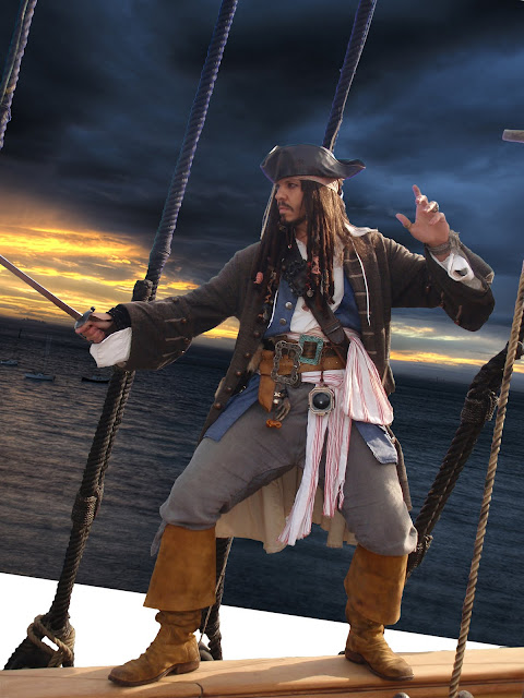
I also at this point i thought it would be funny to pop a picture of Slough behind Jonty. It wasn't funny, but then again, I'm fine with that.
 |
| Come friendly bombs... |
Once that was done, i duplicated the
layer and
desaturated it, then changed the
blending mode to Hard Light, this ups the contrast and makes the image look less 'washed out' - i brought the opacity down to compensate but you may want to play with the
levels.
Colour correction is a pretty boring affair but it always helps to adjust the
hue/saturation,
colour balance and
levels to match what you're working with. I usually wait till my scene is assembled so i can blend things better.
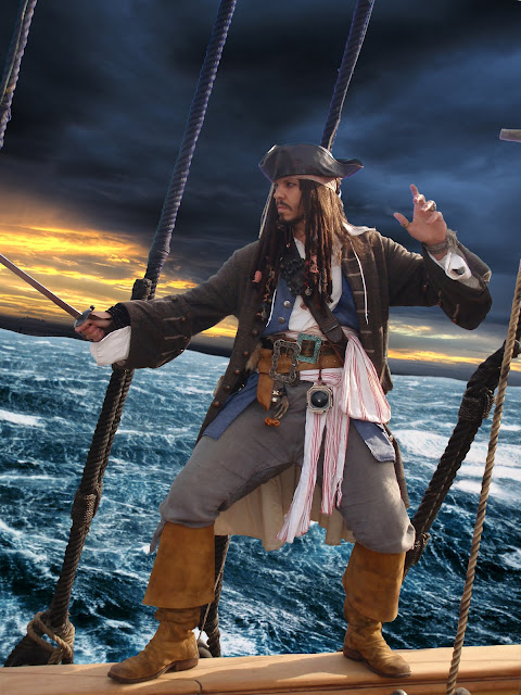
Anyway the next thing i did was add in some sky and sea.
 |
| sky added |
|
I got these images off google search - unless you're chopping beyond all recognition, make sure you own copyright fro the images - blah blah! This isn't a commercial job so i did try and get copyright free pictures - you'de have to be pretty good to spot them once i was done with them though.
Anyway, that was rotated and twisted with the
transform tool before some sea was added. Remember, when using the transform tool you can use the pointer (shortcut V) to click the icons on the selection box. holding Ctrl will let you skew the dimensions, where as Shift will constrain proportions - useful when scaling.
Anyhow, next i added some sea and used an
eraser (shortcut E) to trim a ocean like horizon line.
 |
| well at least now it looks like a ship |
I put a bit of a dutch angle on the sea, though in real life jonty would just fall over. But hey ho.
Now I duplicated the sky layer and pulled it down over the sea to form a reflection. I changed the
layer blending mode to vivid light, lowered the opacity, before erasing everything but the strip you sea in the picture, which sells the two images as being one.
I then used the fantastic
Ron's Splash Brushes, to paint some spray over the join. Welding the sky and sea together without seem, as Conrad once said, i think.
 |
| Arrr! |
Next i chopped out a couple of ships and slapped them on the ocean wave.
 |
| Ambushed! |
Now using the ever funky
Ron's Splash Brushes again, i painted in (on separate layers) spray along the base of the ships - i also added a rain layer just above the background, and some foreground spray where the waves were hitting jonty's ship.
Like so:
 |
| Woooooosh! |
Now, let's look at our ships...bit naff. why has the dutchman not got any sails?
well, hopefully you wouldn't have this problem but i could only find a high res image of the actual ship in dry dock - so no sails.
I made my own just by cutting and twisting a picture of some seaweed, as you'll see in a moment. I think i did a shit job of the sails, so lets not go into that.
However - where's the battle? I wanna taste blood and brimstone, hear the thunder of distant cannons...
Well for that you'll need two more awesome brush sets.
Ron's steam and smoke brushes which are awesome, and
Obsidian dawn's fire brushes (makes me realise i should use deviant art more.)
Using these brushes, i painted in cannon smoke, flames on the blazing ships, smoke from the flames and muzzle flashes. (you may want to add lighting effects, but i was always going to blur them slightly, so didn't bother.
For the flames i used a bright yellow before adding the
layer styles of outer glow red and inner glow orange - i had to set the blend mode on each effect to normal for them to show. i also painted a little white heart to each flame - rememeber fire goes - white, yellow, orange, red, black.
I also added a few splashes from stray cannon hits and colour corrected/blurred the ships - the result was this:
 |
| Garrr! Booooom! |
I now started to add the thing a lot of people miss out when doing rain effects - the dust and drip it creates as it rattles off of your vile creations. In this case - Jonty.
There is no quick way to do this - i some times had a layer for each splash - rotated and shrunk to place before merging.
First of all i started behind the main layer - painting the drip and spray off the rigging and off jonty's back.
I used colour dodge for the blend mode, but there are probably better ones - after doing that i added more rain between jonts and the background ships, as well as a distance haze to separate them.
I lowered the opacity on each of the rain effects so make sure you play with that!
Here is the result:
 |
| What a drip!!! Ha Ha Ha....sigh....I'm so alone. |
|
Well, that was better but jonts still looked like he';d been out in the sun all lah-dee-dah!
Using a black brush with minimum hardness, i painted on wet patches - normally during battle these would form around the armpits and groin, today however i chose a more liberal usage.
I used the Darker Colour blend mode and dropped opacity to about 20%.
 |
| Patchy! |
Yeah, i know it looks a bit shit...
However, next i painted on droplets on his boots, hat and sword. As well as drips off his body.
for the droplets i used the layer style of Bevel and Emboss - i used the spikiest gloss contour and popped the layer fill opacity in the blending options to 50% - this gives it a glassy look. This tutorial explains the effect better than me:
Tutorial on water drops.
The result after that looked like this:
 |
| Hmmm.... |
Then i painted rain splashes on jonts and the rigging, and the rails in the foreground. There are about 120 layers, so it took a while. the result isn't quite what I'd hoped (another 120 layers would sort it) but as I said at the start - it's all about time, and i reached my fill for now.
The result is this:
 |
| splish splash! |
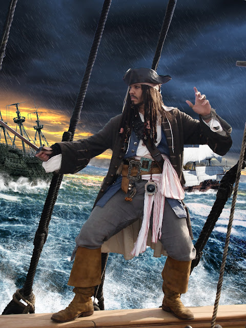
Then it was time for - More rain! I added some drips as well as a bit more haze. I made sure to keep it away from Jonty's face to much so he wouldn't get lost.
I also popped a canvas texture over the whole image, with a low opacity and the blend mode set to multiply.
This not only gloomed it up but added a less digital feel to the image.
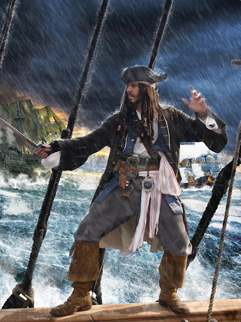 |
| Rain... |
 |
| And misery! |
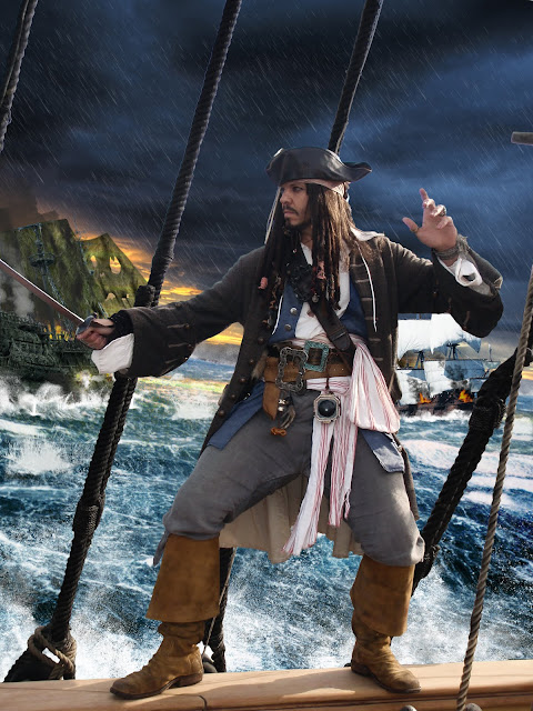
Now all that was missing was a little bit of composition to offset jonts, i felt there was a lot of space above and below and that some framing was needed to pull you in to the the picture.
Using those tasty fire brushes, i added some flame in the foreground, complete with smoke and embers. I used pretty much the same settings as before but added more layers, as it was easier to see now.
I also added some lightning to the flank Jonts. I used
obsidian dawn's brushes and used the smoke brushes i had used before to paint a luminescent glow to the clouds surrounding each bolt.
I added outer and inner glows as with the fire, but aimed for pale yellows this time - all being done, i pulled the fill level down on each layer to soften the effect.
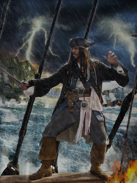 |
| Something's not right... |
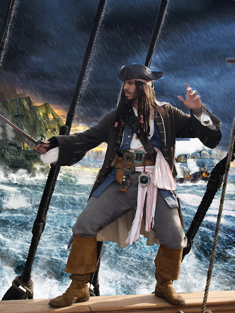
Call me pedantic but it really bothered me how dry the deck looked.
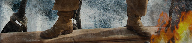 |
| Where's the water? |
So i lassoed the rigging and feet that should reflect on the deck and copied it onto a new layer (right click - layer via copy)
I then flipped the image and lined it up with the edge of the deck and added a
motion blur that was parallel to the line of the hull.
I then used
ocean ripple to distort it some more before switching the layer blend mode to Darker Colour and lowering opacity.
Here's the result:
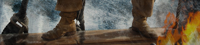 |
| Ooooo, wet! |
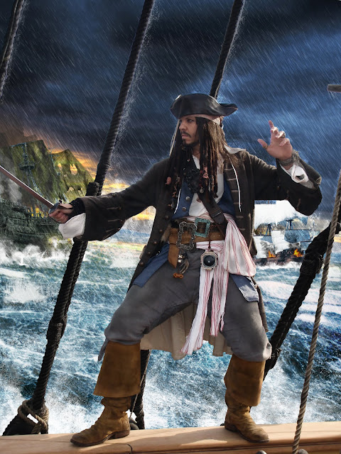
|
With that being done - i think the picture was complete.
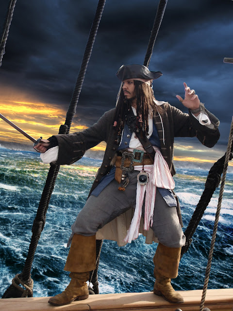
 |
| Jack Sparrow in the rain. |
So there you have it - a few nifty brushes and some simple effects combine forces to collectively kick ass!
Hopefully my ramblings made enough sense should you want to do anything similar yourself.
Remember to visit
Jonty Depp's site and my own site;
Ben Tallamy Website.
_Ben%20Tallamy_www.bentallamy.com.jpg)


